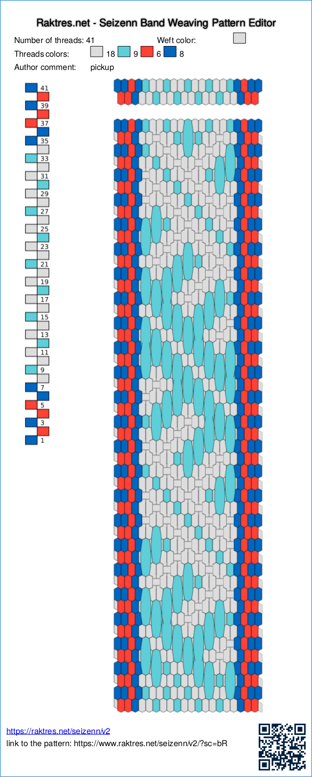
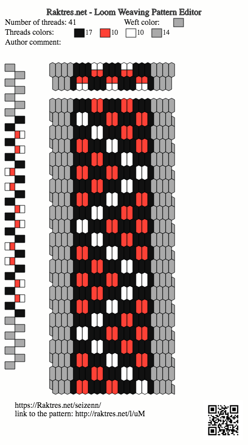
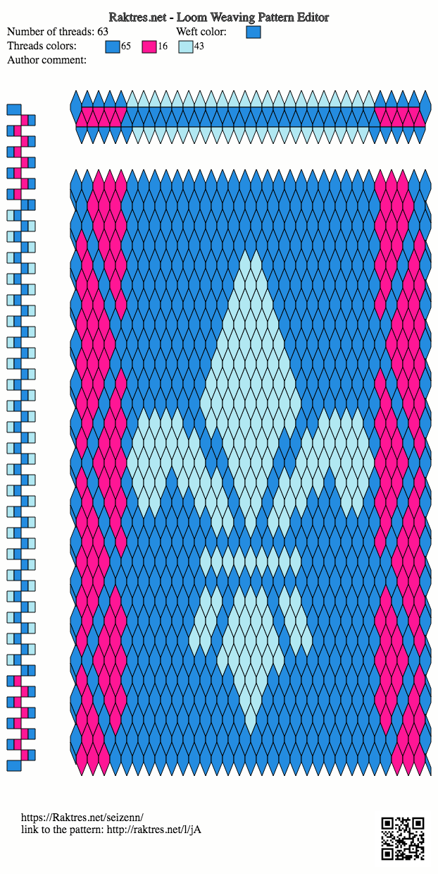
Hi
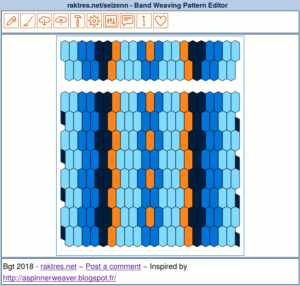
The first version of seizenn (https://www.raktres.net/seizenn/editor.html) was created to work on desktop computers. When I began v2, I wanted it to work both on desktop and mobile devices and not to limit it to English speakers. I thought icons should help me for that two goals.
I received feedbacks saying the new interface was too disturbing.
As I continue to learn new programming things, I’m now able to adapt the new interface https://www.raktres.net/seizenn/
Now on top right of the screen there is a new menu :
![]()
- the broken chain only appears when you are offline
- clic on the icon with the profile to log. It’s red when you are not connected.
- the third one shows if seizenn detect a desktop or a mobile device.
- with the first checkbox, you choose if you want menu on the left of the screen or at the top
- with the second checkbox you choose if you want to use icon or text button
- use the selector to change language.
As an example, with the icon/text checkbox you can choose between
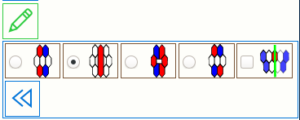 or
or 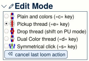
When you open Seizenn on a desktop, the tool uses text button on the left by default. On a mobile device, it uses icons on top. You can change as you want.
You may notice that I now use the new link https://www.raktres.net/seizenn/ for the new version in replacement of https://www.raktres.net/seizenn/v2/. The old version remains available on https://www.raktres.net/seizenn/editor.html
I hope those new evolution will help you.
Jeff

 and choose the
  menu.
menu.
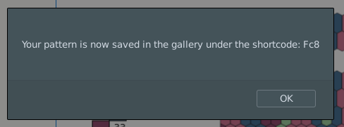
 button, you only get the shortcode to your pattern :
 from the main menu.