Hi
I’d like to share with you a question about the interface of the editor.
In plain mode, interface is easy. You click on an hexagon to change its color.
For pickup it’s a bit more complicated. In fact when you do a pickup, a thread that should be underneath goes above the band.
So, to do a pickup, you need to click on a thread that is not visible. Not easy.
Let’s see an example. On a baltik pattern, in pickup mode:
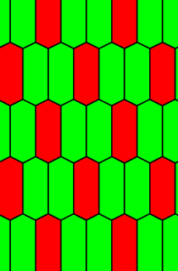
If you want to do a pickup between two red dots, you need to click on the part of the red thread that is under the two green threads. So you need to click in the blue circle.
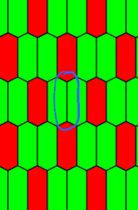
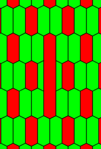
You then get a pickup.
If you click directly on the red dot, the editor will try to find the thread you want to pickup, a thread that is under the red dot. If you click on the right part of the dot, in the purple circle,
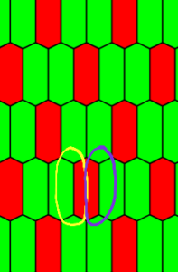
You will get:
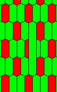
If you click on the yellow circle, you will get:
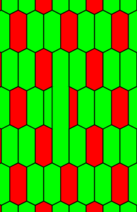
So wherever you click, it’s possible to find a thread to pickup. There is no room to click to indicate you want to drop a thread.
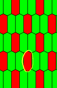
It would be possible to divide each dot in three zones like that 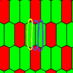 .
.
Yellow and purple zones to drop left and right green threads and blue zone to pickup the red thread.
But like that, clicks should be very precise. It would not work on tablets and phones.
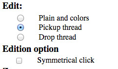
So I decided to create a distinct mode to drop threads.
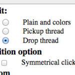
In that mode when you click on an hexagon, the thread goes underneath.
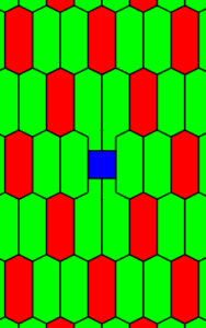
So the weft become visible.
If there was a specific version for home computer, we could imagine to use clicks to do pickups and to click with the shift key pressed to drop a thread. But there is a single version.
Maybe pickup interface could seems awkward but I didn’t found a better solution.
If you have a preference or a better solution, please let me know.
Jeff
